
Infographic Illustration Services
Custom Infographic Illustrations For Engaging Data Visualisation
I create clear, engaging infographic illustrations that turn complex data into visuals people want to look at - from diagrams and charts to graphs and pictograms.

Example of a cutaway-style informational illustration: the Great Pyramid at Giza
Infographic illustrations I’ve created
Published work and self-initiated examples
Cross Section and Cutaway Illustrations
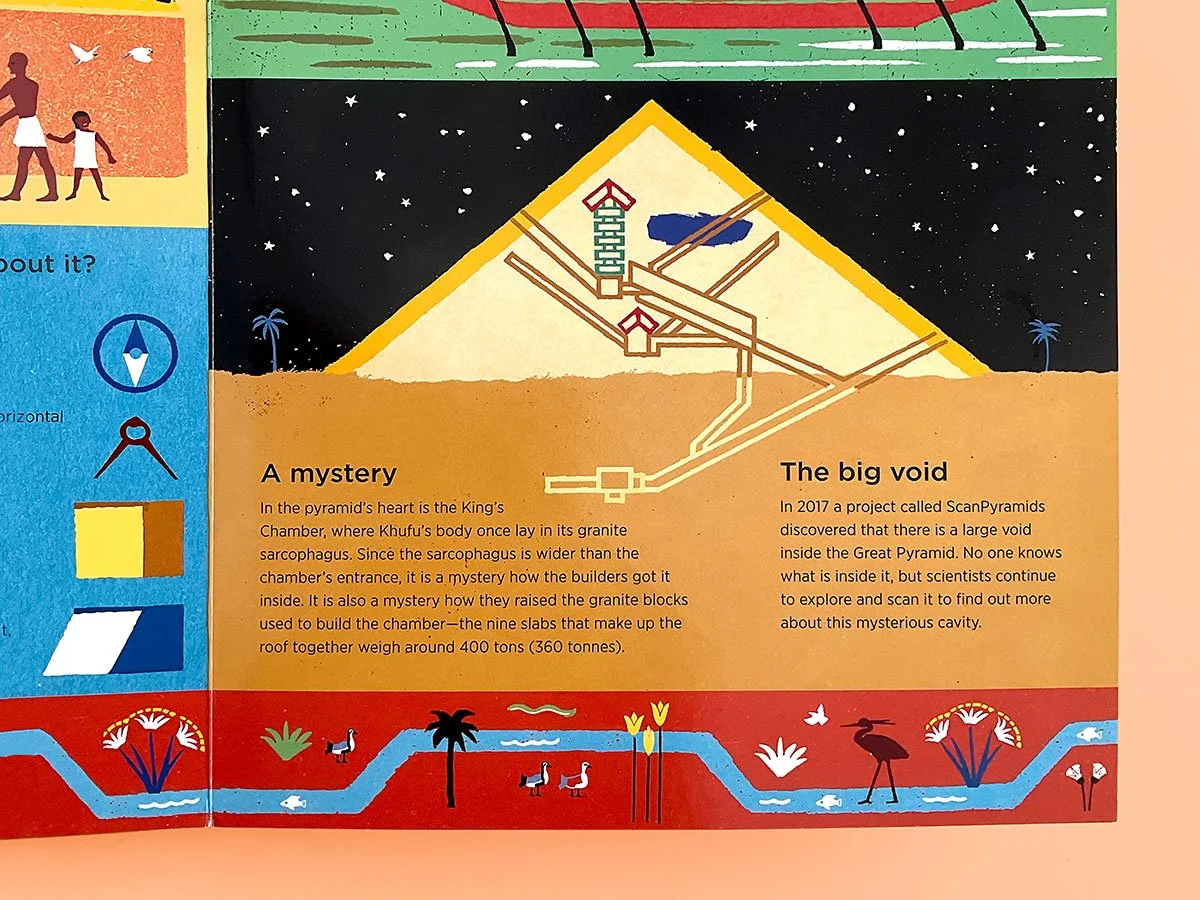
My cutaway illustration in place on the page, doing the job of explaining the internal structure quickly and clearly within a dense layout.
Step Inside! My detailed cross-section and cutaway illustrations reveal the hidden interiors of buildings, objects, and structures; making complex or unseen details easy to understand at a glance.
Using modular forms and curated colour palettes, I simplify intricate information into clear, digestible visuals. Vintage textures add warmth and energy, resulting in artwork that is balances function and engagement - perfect for architectural presentations, educational content, editorial publishing, and branded materials.
Explore more from this publishing project, involving cross-sectional illustrations, here
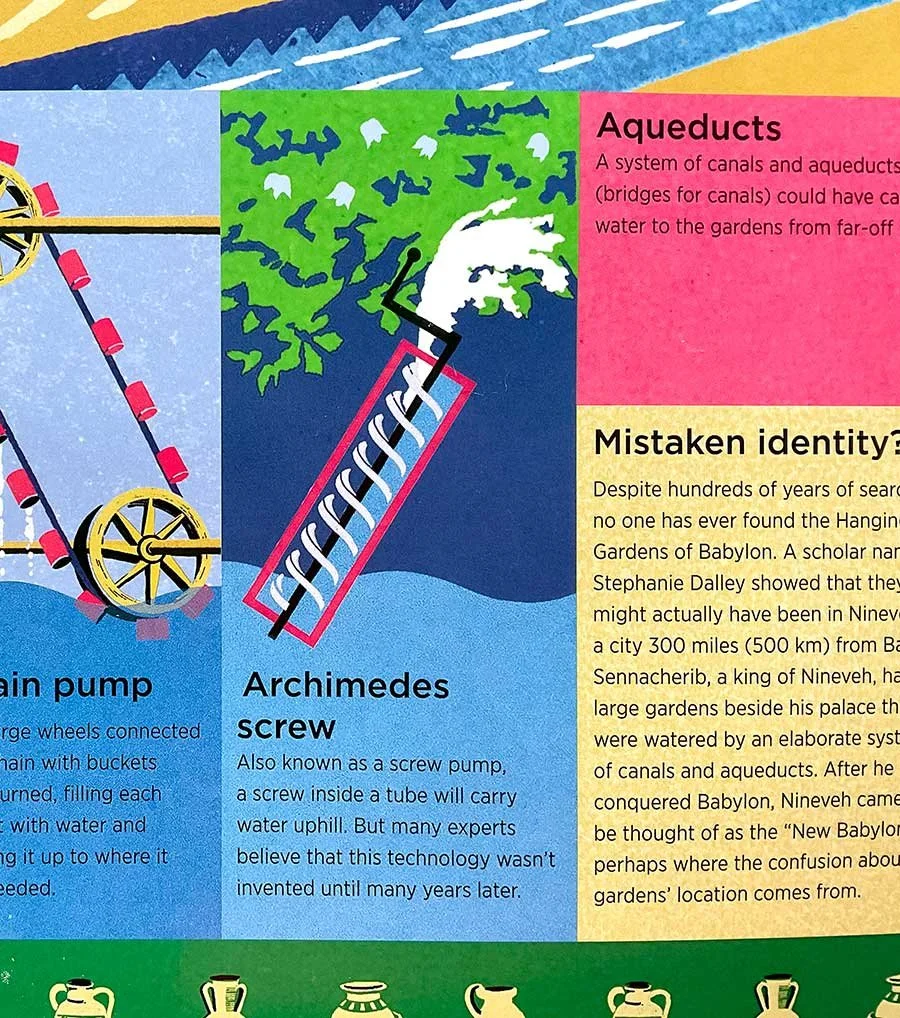
Illustrated cutaway view, showing how the Archimedes Screw lifted water in ancient engineering systems.
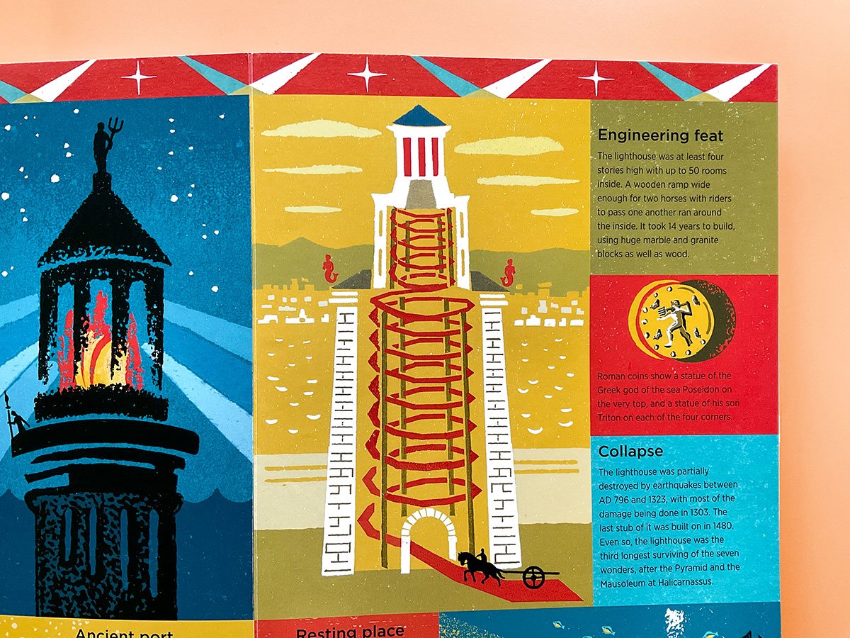
Interior reveal illustration of the Lighthouse of Alexandria, with cutaway showing how internal ramps allowed horse access.
Make data more human
-
Turn facts into visual stories
-
Illustrate your impact
-
Help people understand
-
Shape how information feels
-
Make data more human - Turn facts into visual stories - Illustrate your impact - Help people understand - Shape how information feels -
Cultural and Conceptual Infographics
Hand Lettered Diagrams: My handmade collage art approach turns traditional diagrams into lively visual stories: making information look friendly and un-intimidating so it’s easier for people to engage with and remember.

Colour Coded Diagrams: With colour know-how, I codify information for effortlessly absorption. Using logic, comparison and sometimes humour as infographic illustration techniques, I provide visual reasoning with a light touch!

A hand lettered Venn diagram using colour to visualise overlaps in heritage, accent and culture

A diagram that uses colour logic to demonstrates why purple is a diplomatic choice for Liverpool’s wheelie bins:
These infographics stood out and provided fast visual clarity in an information-rich page. See the project in full here
Custom infographic illustration for campaigns
-
Hand-drawn data visuals for reports
-
Illustrated explainers for science and culture
-
Accessible diagrams for presentations
-
Custom infographic illustration for campaigns - Hand-drawn data visuals for reports - Illustrated explainers for science and culture - Accessible diagrams for presentations -
Process and Workflow Diagrams
You’ll find more workflow and process diagrams in my How It Works section, showing systems, processes, and ideas clearly and visually. Take a look for more examples in action.


Visualise more than just data with infographic illustrations that are:
-

Accessible
Communicate complex data clearly and quickly - making it easy for your audience to engage and understand.
-

Relateable
Charm audiences with playful, handmade, collage visuals that bring out your brand’s personality and story.
-

Distinctive
Make a memorable brand statement - by giving your audience quirky human-made art instead of another smooth chart.
Looking for infographics with playful quirks that make your data clear and memorable?
Let’s chat - I’d love to hear about your project.