
Illustrated Boston Neighbourhoods Feature
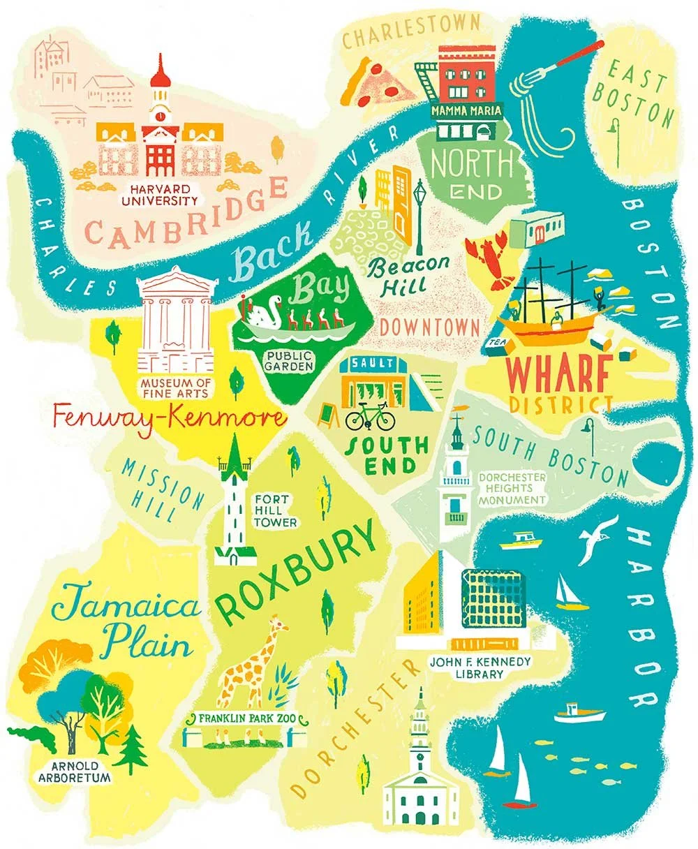
The full Boston map balances tightly packed central districts with larger residential areas. I use colour blocks and scale tweaks to balance busy districts with wider neighbourhoods, so every area is easy to spot, but the city still holds together as a whole.
Boston is a city full of character, so my illustrations needed to reflect that while working seamlessly with the editorial story. The brief asked that I highlight featured neighbourhoods, but Boston’s most interesting areas are tightly packed in the centre. To keep everything legible, I nudged and stretched the map just enough to let featured areas stand out, while allowing more residential neighbourhoods to breathe.
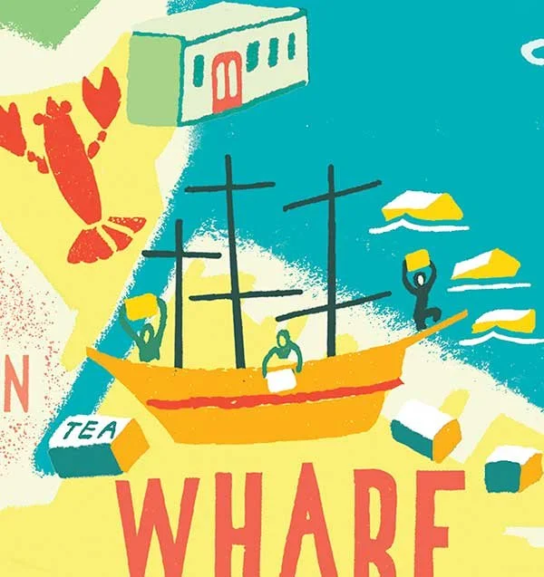
Small area, layered detail.
This zoom shows how a map can work on two levels: designed so you can quickly see what’s where, with narrative details - like Tea Party figures - for anyone who looks closer.
Colour is always my secret weapon for clarity. I created a palette inspired by Boston itself: brick reds, classic greens, leafy shades, and watery blues. Each neighbourhood needed to be visually distinct without the map becoming fragmented or overly busy, so I developed the patchwork of districts using analogous colour: this way the background hues are all cohesive and not a multicoloured jumble. The exception is Cambridge, technically outside Boston (so, that’s where Harvard is!), which I gave a touch of warmth to set it apart while still at home in the colour landscape.
Lettering and labels follow the story’s lead. The brief’s key neighbourhoods are spotlighted with bolder, more contrasting treatments, while supporting areas sit back slightly, so they are present but not competing for attention.
Throughout, my approach is loose and organic, resulting in something lively but not fussy. Hand-drawn lines, forms and textures play on the surface, disguising the careful planning beneath.
Alongside the main map, I created spot illustrations for each key neighbourhood; exploring little worlds within the main location.
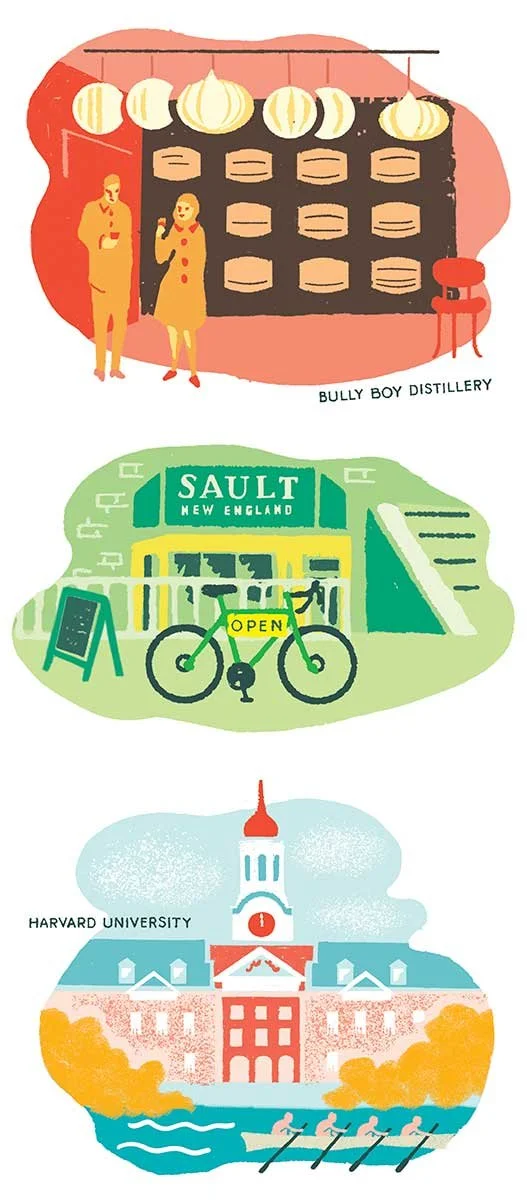
Controlled palette, distinct atmospheres.
Each vignette draws from the main Boston colour system, but with a deliberate shift in tone (and temperature). The distillery/bar interior leans into warm reds and glowing light; the basement shop scene settles into heritage greens and mid-tones; Harvard opens into cool blues and lots of airy contrast. By curating the project’s main palette and adjusting light, each scene feels distinct while remaining visually unified.
Each scene borrows from the main palette, with the light and mood tweaked so each spot feels distinct. Playing with darks, mids, and highlights lets me set the atmosphere for each place. These mini-scenes let the city’s story spill beyond the map, personality, and depth - while still tying everything together visually.
If you’re planning a place-led commission, whether a city map or a series of immersive scene illustrations, I’d love to hear about it. Clear structure, considered colour, and thoughtful detail are where I’m happiest.
Or see how I approach map illustration for hospitality and lifestyle brands here.