
Regional Arts Map Illustrations
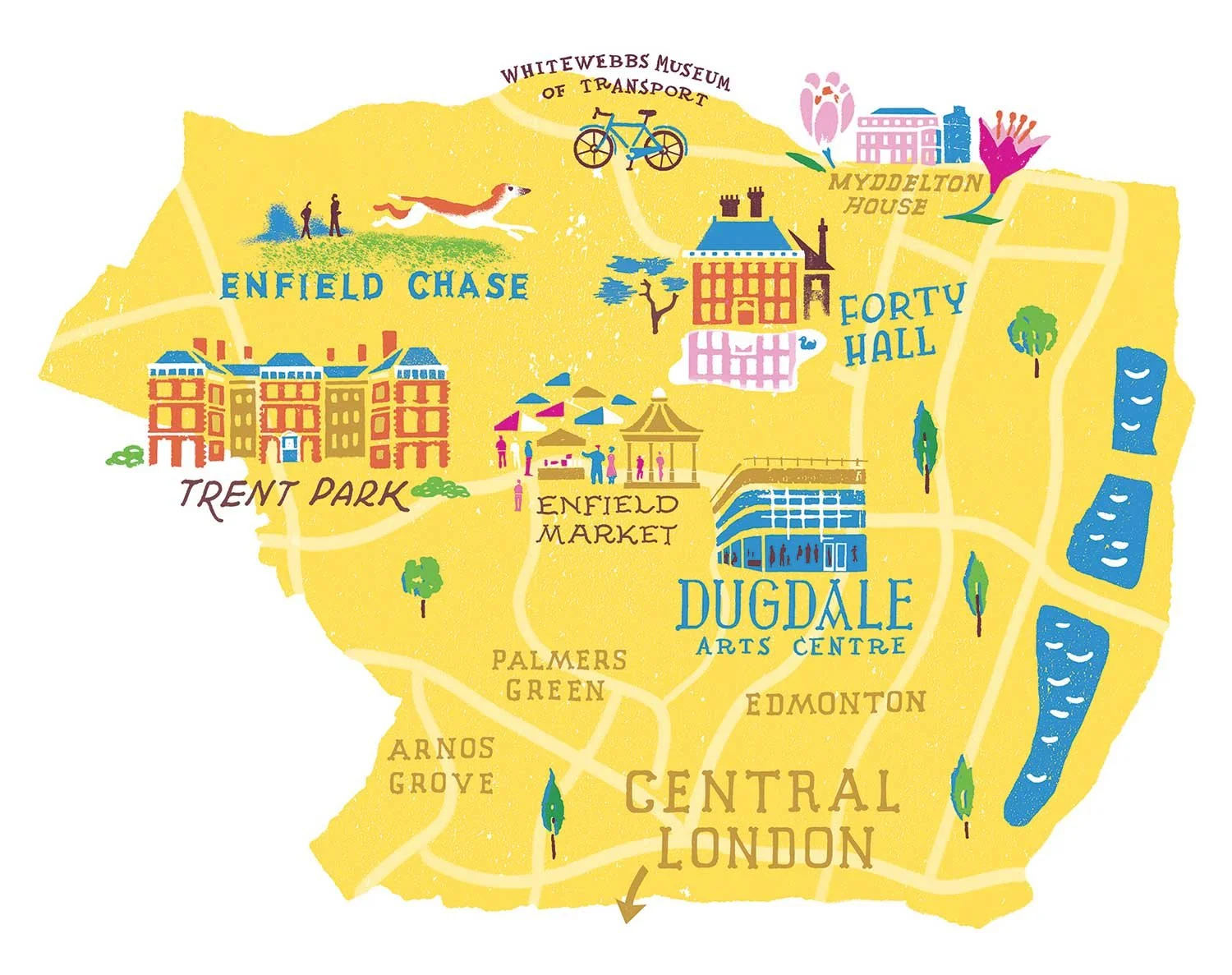
Illustrated regional arts map of Enfield; for this Spring issue I evolved a bright palette, informed by the colours of crocuses, referenced in the feature in relation to Myddelton House.
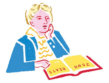
John Keats Spot Illustration
John Keats, caught mid-thought with an open book—his pose nods to Joseph Severn’s 1819 portrait, a detail art-loving readers might spot, Colour and handmade texture is adapted to the map spread.
Arts publications are always rich with imagery, and The Arts Society’s membership magazine is no different. When I was invited to create their ongoing illustrated What’s On map, I knew it would need to hold its own among a mix of paintings, prints, crafts, and theatre photography.
For every issue, I draw a new map spotlighting the cultural highlights of each region. Alongside this, I contribute spot illustrations that dig into local history, architecture, or notable figures—offering readers a fresh perspective and another layer of storytelling.
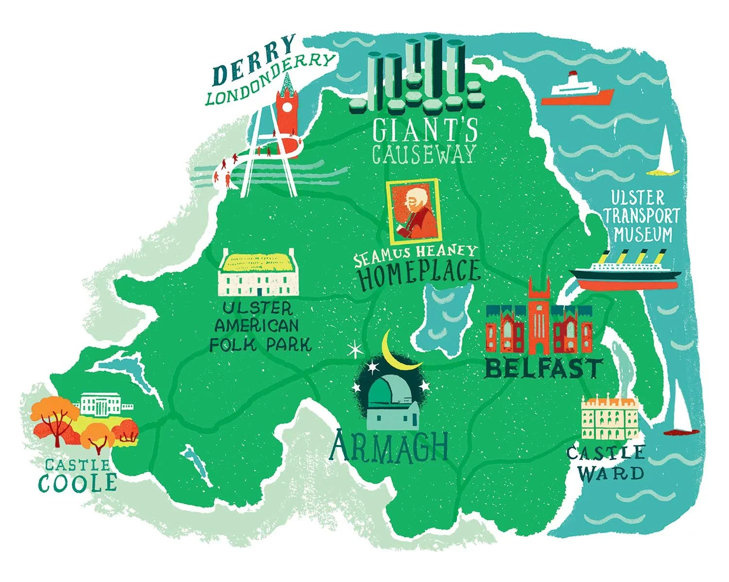
Illustrated map of Northern Ireland: the client wanted green for the “Emerald Isle,” so for this winter issue, a green-soaked background with berry-red highlights felt like the perfect wintry, Christmassy combination.
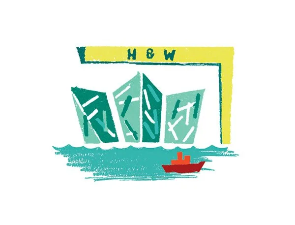
Belfast’s iconic waterfront landmarks
Highlights local culture and landmarks, tied to the map’s palette. The red and green pairing adds warmth and festive character while keeping the illustration cohesive
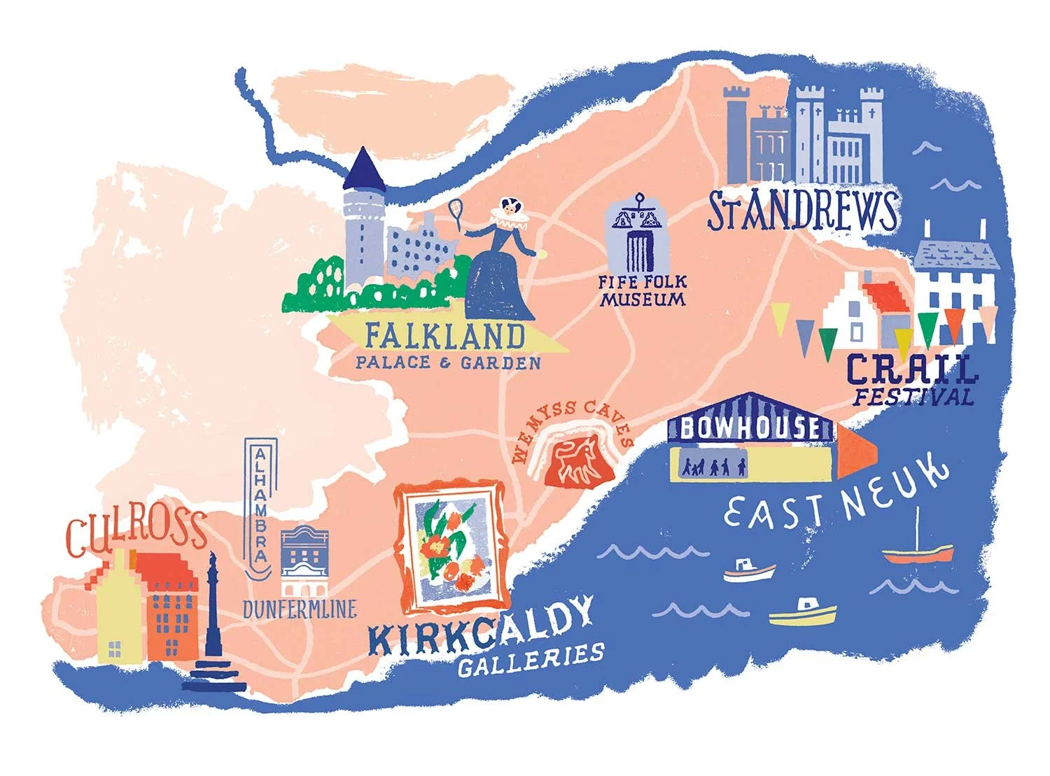
Fife: I picked a summery, coastal palette, and loved bringing historical details to life. Mary Queen of Scots playing Real Tennis jumped out, so I included her; letting the character act out the text.
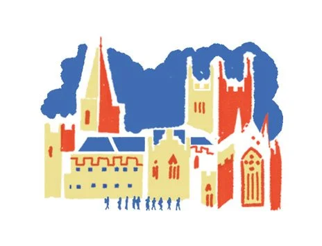
Dunfermline Abbey Spot Illustration
This little illustration highlights a must-see location from the introduction. I used a pared-back palette of blue, red, and yellow drawn from the main map so it feels connected to the spread while standing alone. Tiny pilgrims add movement and narrative, helping the page feel balanced and lively
My layered style, with its visible print marks and painterly textures, brings a handmade quality that fits happily among the magazine’s creative visuals. I’m also drawn to mixing eclectic references, which aligns well with the publication’s blend of contemporary culture and art history.
My contribution to this series is part drawing, part puzzle-solving. For each issue, I create a map showing the arts events featured; galleries, festivals, performances, gardens, and more. I make sure everything is balanced on the page so it’s easy to look at, while also giving more visual weight to the places the writing highlights most.
So, it’s a mix of design and editing: choosing what to include, where to place it, and how to make the image support the writing. I used texture and colour to suggest neighbouring counties subtly, keeping them visible but never distracting from the main focus. My spontaneous-looking illustration approach makes each map feel natural and effortless, not overworked - even when it’s very carefully planned.
Each region is a small exercise in turning words into pictures that look handmade and energetic, while keeping the information clear.
See more examples of my map illustrations here or get in touch to discuss a project