
Illustrated Table Markers for a Buenos Aires Themed Fundraising Gala

Puerto Madero reimagined as a night skyline with twinkling stars. Blending hand-lettering and bright lights for an atmospheric sense of place.
Table marker signs serve a practical purpose - ensuring guests sit in the right place- but on this twinkly night, they were also part of the storytelling. My illustrated event table markers were custom-designed to immerse guests in the sultry tango supper-club ambience of Buenos Aires.
The event was a fundraiser for a theatre with rich decor: berry reds, soft sage greens, lush fabrics and jewel-toned floral arrangements. I collaborated closely with the designer and marketing team to create illustrated event table markers tat sat comfortably within this visual world - picking up the event’s colour palette and helping everything feel considered and cohesive.
Functionally, the table marker designs had to be bold, high-contrast, and instantly legible- even in slinky, atmospheric lighting. But more than that, they had to guide guests to their seats with zero fuss; no awkward reshuffles or quiet detours from the wrong premium, table thank-you-very-much! Clear signs meant a smooth, relaxed start to the evening.

Evoking the character and vibrancy of Palermo, this view mixes architectural quirks, cobblestones and hand lettering into a lively street-level portrait.
I brought warmth and personality to the designs through vintage textures and eclectic, handcrafted lettering; a style that helped shift the focus away from any sense of pecking order in the seating allocation. And, thanks to the client’s inspired decision to name the seating tiers after neighbourhoods, each illustrated event table marker became a small celebration of a different cultural theme relating to Buenos Aires. My love of exploring cultural themes and motifs in sensitive, non-clichéd ways complemented this thoughtful approach, placing emphasis on character and interest rather than hierarchy.
Inspired by the square format of the table markers, and nostalgic Tango vinyl covers on my research-travels, I embraced a mid-century modern illustration style with retro record sleeve vibes. This timeless cue captures a night-time allure, reminiscent of an innovative design era, forever linked to music, theatre, and dance- a perfect language for the event’s theme and sure to to click with the client's cultured guest list.

A retro-style take on historic Recoleta with an illustration hand-lettered cartouche and grand statues and monuments in moody light
Finally, and perhaps above all else, the client needed the evening to strike a delicate balance between celebration and restraint. They wanted to thank their generous sponsors and treat them to a fun, memorable experience, but through creativity and consideration instead of spendy extravagance.


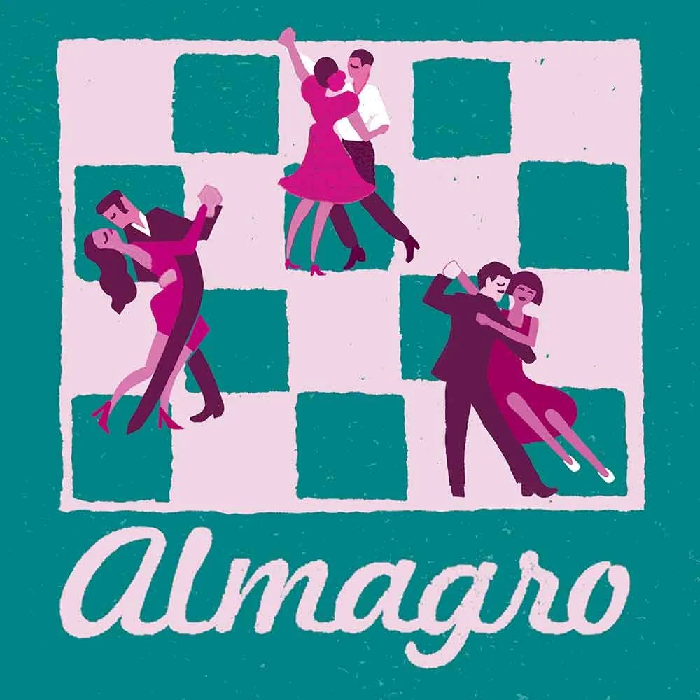
Three more Buenos Aires neighbourhoods: San Telmo, La Boca, and Almagro, captured through colour, hand lettering, and local character, each illustration a snapshot of place with its own mood and rhythm.
This is where illustration comes into its own, adding uniqueness and depth without being flashy. In this project, my style wasn’t just an aesthetic choice, it became part of the message: that luxury doesn’t have to shout. And that was exactly what the client wanted: event table markers that were not only practical, but also sensitively custom illustrated.
Ultimately, the night didn’t end at the table- it ended with a dance. And the quicker the guests found their seats, the sooner the party began!
If you’re interested in commissioning something like this, I’ve put together a short page here explaining how this kind of work fits into what I offer.
Interested in custom illustrations that bring your event to life? I’d love to hear from you.