
Hand Lettered Illustrations for Editorial, Cultural and Branded Projects
I create hand lettered illustrations for editorial features, museum merchandise and print publications, drawing on historical and vernacular references to shape titles that feel rooted in place and subject.

Examples of location-name lettering drawn from my map work - shaped by history, culture, and place.

Lettering with history, texture, and a life of its own
Here are a few projects where my hand lettering played a central role - from shaping titles to defining moods
Hand Lettered Swing Tag for Royal Museums Greenwich
I hand lettered the words “London and Greenwich by Anna Simmons” for a merchandise range at Royal Museums Greenwich. The lettering appears on biscuit tubes, mugs, tote bags, and swing tags, drawing on vintage styles for a heritage feel that’s still fresh and lively.
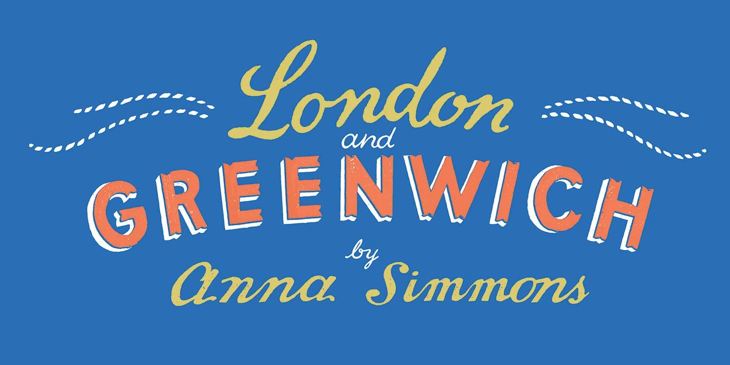
The original hand-lettered artwork I created for the merchandise and packaging. The lettering is shaped by history, culture, and place, drawing on vintage styles and maritime-inspired motifs to give each piece a distinctive, heritage-inspired character.

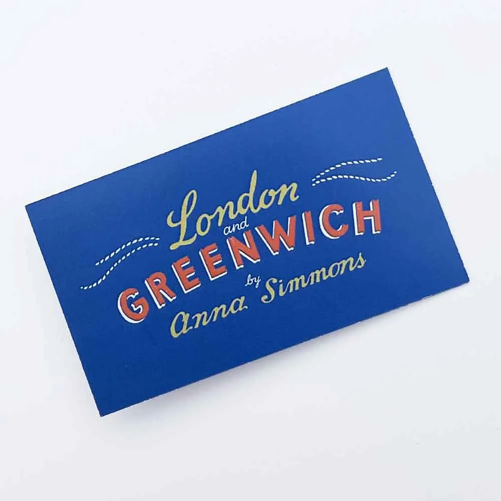


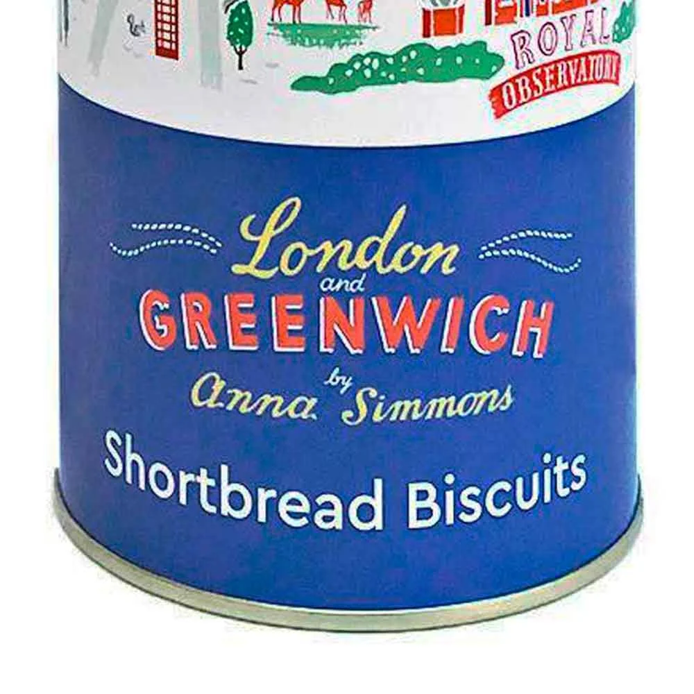
A selection of items from the merchandise range showing how my hand lettered design adapts across different sizes and formats - from mugs and tote bags to biscuit tins, swing tags and packaging sleeves. The lettering becomes a unifying visual identity for the collection, almost like a bespoke logo.
The bold, memorable lettering helped the products stand out, giving visitors a little piece of Greenwich to take home.
See the full project here: Souvenir Product Illustrations for National Museums.
Letters that connect instantly
-
Add personality to every word
-
Express ideas with a human touch
-
Letters that connect instantly - Add personality to every word - Express ideas with a human touch -
Illustrated Story Told Through Hand Lettering

Custom hand lettering and illustration lettering combine to create dynamic, narrative-driven visuals, showing how letters and imagery can guide the reader and add character to commissioned projects.
For a self-initiated contribution to an independent magazine on food and community, I created a storyboard that tells a story entirely through hand lettering and illustrated storytelling: no typed text.
Sometimes the lettering drives the narrative. Sometimes it interacts with the imagery. Sometimes it shows acted-out scenes. Every word is placed carefully so it’s easy to read and engaging. It draws readers in, makes them look closer, and helps the story click instantly.
This kind of custom hand lettering combined with illustration makes words feel alive. It guides readers to the important parts, keeps them enjoying the story, and makes it stick in their memory.
Through this project, I show how custom hand lettering integrated with illustration can guide the audience to important points, and keep them enjoying the story, while making it stick in their memory. Using this hybrid approach gives your message a unique personality and energy.
See the full project here.
Title Hand Lettering for Reader’s Digest

Bespoke hand lettering within illustrations. The yellow “SOUTHEAST” lettering sits over playful, sticker-style illustrations, showing how I deliver integrated hand lettering illustration services that are research-informed, visually engaging, and full of personality.
I created hand lettered titles for four regional books for Reader’s Digest’s Great American Road Trips. Each needed to stand out over landscape photos while following the art direction for that volume. The theme in this example was: old-school sticker-sheets.
Working on this project, I enjoyed researching and adapting my lettering approach to reference different historical hand lettering styles. Even when working in a specific style, my letters always carry my own hand - so clients get work that fits their brief while still feeling distinctly handcrafted and full of personality. This approach ensures that the custom lettering connects with readers, giving each project a unique voice and a warmth that draws people in.
You can see other hand lettered titles from this project here
Hand Lettered Headline for Atlanta Magazine Double-Page Spread
As an illustrator who hand letters, I can weave words directly into scenes so they become part of the visual story. In this double-page spread, the hand lettered headline does double duty: it looks like part of the scene and carries key information for the reader.
I created a bird’s-eye view of the Gulf of Mexico coastline, with a plane pulling a swirling banner that carries the title. The lettering and illustration work together, guiding the eye, giving the page movement, and shaping how the audience takes in the scene.

Integrated hand lettering: woven into the illustration, it guides the eye across a lively coastal scene while announcing the subject in an eye-catching way.
Hand lettering for editorial titles and headings
-
Packaging and merchandise lettering
-
Illustrated lettering for print publications
-
Hand lettering for editorial titles and headings - Packaging and merchandise lettering - Illustrated lettering for print publications -
Hand Lettered Donor Communications Illustration for Marie Curie
I hand lettered a full page for a Marie Curie supporter publication, putting the title Here, There and Everywhere over an illustration of the UK. The hand lettering draws you in and sets the tone for the feature that follows - it lets reader know that they’ll be reading about the good work nurses do, without the focus being on hard or sad topics.
The imagery gives context, but the lettering is what makes the page welcoming and warm, encouraging readers to explore the content. By uniting all the different story threads in a single visual, the design helps the charity connect with supporters and makes the publication more engaging and readable.

Hand lettering doesn’t have to sit still - the flowing title adds movement and energy to the opening page.
Custom Title Lettering for Print Materials
I created a hand lettering design for the title on printed handouts for a coastal business on the Isle of Wight. Being an illustrator who hand letters, I designed the words and images to work together: the handmade letters signal care and individuality, so people instantly sense that the place itself offers the same kind of attention and warmth.
The lettering on the front hints that illustrated content waits inside, inviting people to pick it up and look closer. It helps the piece stand out, giving it a tailored, handcrafted feel before a single word is read.
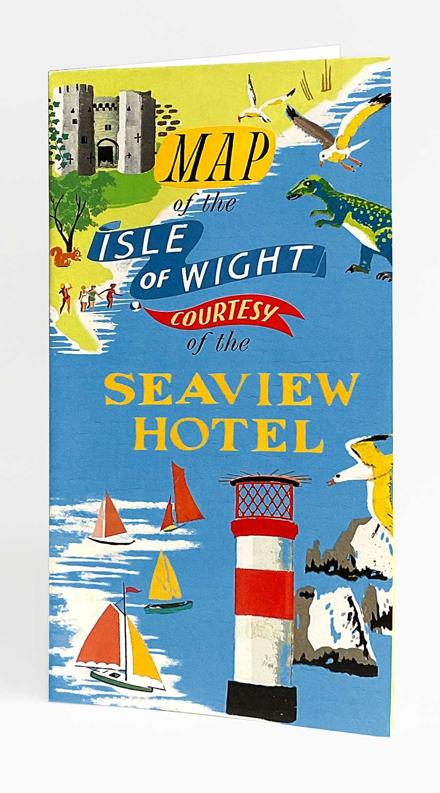
If it’s in it… it should be on it. The hand lettering on the cover hints at the illustrated world inside.
Used by heritage organisations, publishers, and creative studios
-
Enhancing visibility and memorability for projects
-
Helping brands communicate with character
-
Used by heritage organisations, publishers, and creative studios - Enhancing visibility and memorability for projects - Helping brands communicate with character -
Frequently asked questions
-
Pricing depends on scope and usage. A single editorial headline is priced differently from lettering for retail packaging, merchandise, or a publication series. Once I understand what you’re making, where it will appear, and the deadline, I’ll provide a clear quote covering what’s included and the agreed licensing.
-
Most projects take 2–4 weeks, depending on complexity and feedback stages. Larger packaging ranges or multi-piece publication work may take longer. I confirm a timeline before starting.
-
A short brief covering: format (packaging / spread / cover / etc.), intended audience, where it will be used, deadline, and any essential wording. If the project has a strong place, period, or subject context, that’s useful upfront because it informs the direction.
-
Concept options, a minimum of two rounds of refinement, and final artwork prepared for the agreed use (editorial, print, packaging, merchandise). Final files are supplied in production-ready formats.
-
No. This is project-specific lettering for a defined application. I don’t produce downloadable fonts or full identity systems intended for unlimited reuse.
-
I develop the work primarily as layered Photoshop (raster) artwork, so refinements stay flexible until sign-off. If a project genuinely requires vector elements for production, that can be handled as a practical requirement.
Best for:
Art directors and editors needing editorial titles for print.
Cultural organisations needing lettering for visitor-facing print and merchandise.
Brands and studios needing lettering for packaging and printed product materials.
Teams working on place-led or period-led projects needing researched lettering.
Less suitable for:
Clients looking for ready-made fonts or off-the-shelf lettering
Projects requiring a fully engineered logo system or scalable type family
Ultra-fast turnarounds with no time for research or development
Need hand lettering for your project?
Lettering designed for a specific use — editorial, packaging, or print.