
Contextual Illustration for Editorial and Cultural Projects
I work with editors and cultural organisations to bring stories about places, people, and history to life through scene-led illustration. From single spots to more developed settings, I design each image to work within the layout and support the wider narrative; helping readers move from the big picture to the detail.

Focused spot illustrations designed to read clearly at small scale while retaining character and place.
Not everything fits on a map
Here are scene-based illustrations created to expand and support wider stories
Preferred Travel Magazine — Boston Scene-Based Spot Illustrations
Alongside a city-wide map, I created a series of spot illustrations, each paired with a short piece of editorial text about a bar, shop, or landmark. The opening spread helps readers get their bearings, while each spot zooms in to give a closer, street-level feel.
I worked with a colour palette inspired by Boston’s mix of brickwork, green spaces, and waterfront blues, making sure each illustration had its own mood and light, but still felt like part of a set. Every piece stands alone, but together with the map, they help readers explore the city’s highlights and discover hidden gems beyond the obvious stops.
To explore how maps and scene illustrations work together within a single editorial commission, see the full Boston project here.

Designed as modular assets, these spot illustrations integrate cleanly into the editorial layout. This keeps the visuals cohesive, but gives the team plenty of room to play with placement.
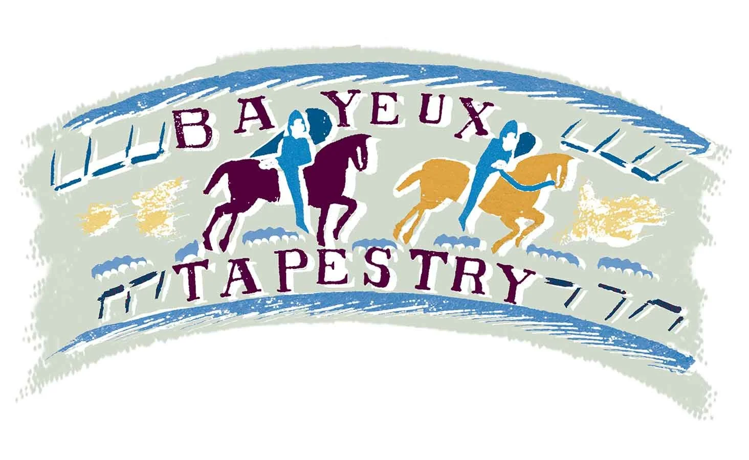
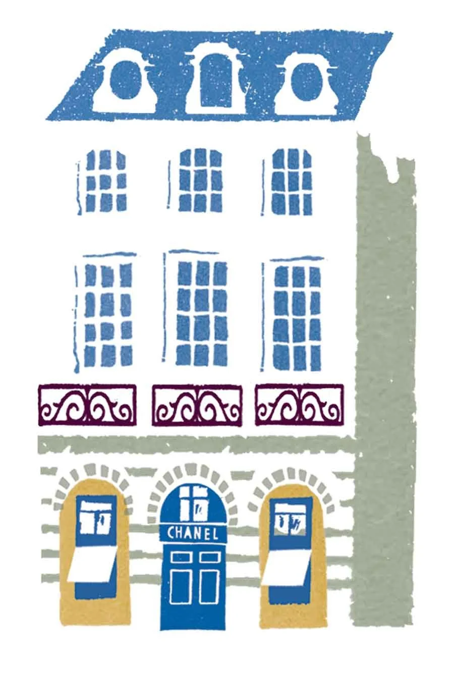
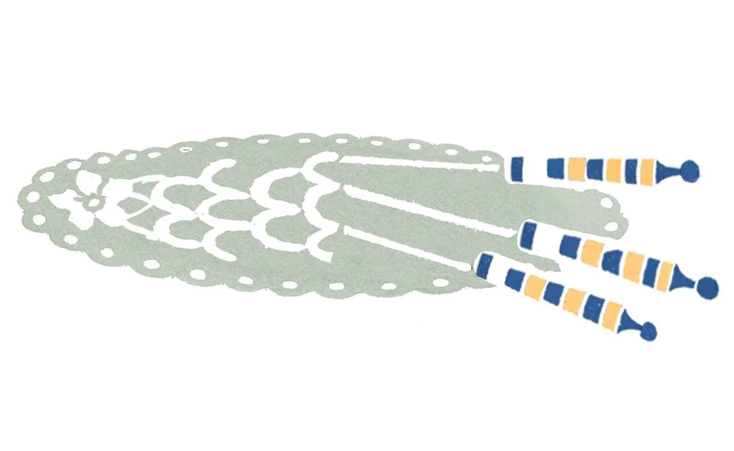
Selvedge — Textile Heritage Spot Illustrations
For this feature delving into French textile history, I created a set of spot illustrations that pull out some of the most iconic cultural references; from details of the Bayeux Tapestry and traditional lace making, to cornflowers that symbolise regional identity, and the original Chanel building.
My approach was to translate each subject into a clear, focused image that would be instantly readable on the page. It was important that every illustration could stand on its own, but also work together to set an overall mood for the feature.
To keep everything feeling connected (and not at odds with the surrounding text), I pared back the forms and worked within a carefully chosen colour palette. That way, the historical details and textures come through, but the layout stays balanced and easy to navigate. Explore this project further here.

Spot illustrations designed to read clearly at small scale while conveying character and narrative.
The Arts Society Magazine — Cultural Spot Illustration Series
For this ongoing editorial commission, I create a new spot illustration for each issue, always responding to a fresh and varied set of cultural subjects. Past themes have ranged from literary figures like John Keats to distinctive architectural landmarks and sites with rich historical significance.
My focus with each piece is to capture the essence of the subject in a way that feels clear and instantly readable, so the illustration can sit harmoniously within the magazine’s layout. Working at a small scale requires careful simplification of form and a disciplined colour palette, ensuring the image holds attention without overpowering the surrounding text.
See more illustrations from this project in my portfolio.
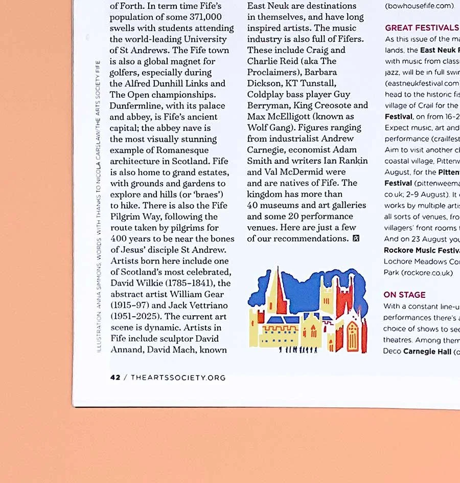
Spot illustration of Dunfermline Abbey shown within the layout of The Arts Society Magazine.
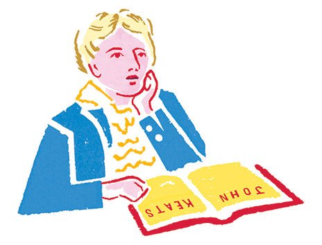
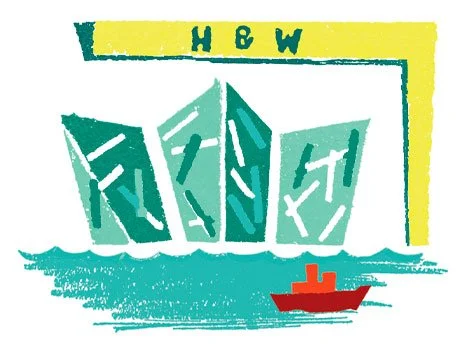
Spot illustrations from the series range from literary figures such as John Keats to cultural landmarks like the Titanic Museum in Belfast.
Commission a spot or scene
If you’re looking for a thoughtful, well-structured illustration that supports your editorial story, I’d love to hear about your project.