
Tourism Map Illustration for Destinations and Travel Brands
I create tourism map illustrations and custom illustrated destination maps for tourism boards and travel brands - designed to promote places, highlight key attractions, and help visitors explore with a sense of excitement and ease.

An illustrated tourism map of Tenerife, showing key landmarks and coastal highlights to help visitors imagine the journey before they arrive.
My maps help destinations stand out.
Here are a few from tourism campaigns, city guides, and national travel features
Treasures of Tenerife for British Airways and Metro UK
This illustrated map of Tenerife was commissioned for a double-page travel feature in Metro (UK), created in partnership with British Airways and Tenerife Tourism. The goal was to inspire year-round travel by combining destination highlights with reader-generated tips.
The map ran nationally in print as part of a broader campaign positioning Tenerife as a culturally rich destination. The full spread includes a hand-lettered title, annotations across the island, and a zoomed-in city map of Santa Cruz - a map within a map.

Double-page illustrated map feature for Metro newspaper and British Airways, promoting year-round travel to Tenerife.
The artwork spans the whole island, from Mount Teide and UNESCO forest parks to beaches, markets, and towns, with each point of interest illustrated and labelled in an A–Z key.
The collage-style illustration brought warmth and texture to the campaign, turning practical travel details into an engaging visual story. The hand-lettered title added cohesion across the spread and made it feel friendly and fun to explore.


One of the reader quotes featured in the A–Z key: “Rent a car and drive up Mount Teide for the most beautiful sunset and stargazing you will ever see!”
I’ve illustrated promotional maps for other tourism campaigns too, like this travel map for a print feature encouraging visits to Holmes County, Ohio. The numerical layout worked as a visual aid: helping readers navigate the key and break down the content at a glance.
To see the project in full visit my portfolio here.

Visitor Map for South Dakota Tourism
This illustrated map of South Dakota was commissioned as a double-page spread for the official state tourism guide; a clean, focused visual to help visitors navigate key destinations across the region.
The brief called for a pared-back style with minimal lettering, and an emphasis on my icon illustrations. The layout needed to balance accurate wayfinding (including Interstate 90, Highway 29, and tourist information centre locations) with a style that still felt friendly and engaging.
The result was a clear and approachable map that gave the guide strong practical value, supporting self-guided road trips and encouraging exploration across the state.
It was used in both print and digital formats, helping reinforce South Dakota’s position as a road trip-friendly destination.

A user-friendly South Dakota visitor map combining accessible travel information with colorful icons and clear wayfinding to prevent text overload.
Bring destinations to life
-
Make places feel discoverable
-
Add charm to practical information
-
Bring destinations to life - Make places feel discoverable - Add charm to practical information -
Themed Trail Maps for Georgia Tourism
I illustrated destination maps for Georgia’s state travel guide, each showing a themed route - one for the Chieftains Trail (historic sites) and another for a wildlife trail through the state’s wetlands and forests.
The client wanted something textured and organic that reflected the landscapes and gave the guide a handmade feel. I used hand-drawn icons, collage layers, and warm, earthy palettes to give each trail its own identity while still feeling part of the same series.
The maps encouraged visitors to look beyond the usual hotspots, helping smaller destinations attract attention and giving the travel guide a stronger role in regional tourism campaigns.

This hand-drawn route connects key Native American heritage and frontier-era sites.

This illustrated route highlights conservation centres and wild habitats, brought to life with native species and lively colour.
Holiday Shopping Map for Choose Chicago
I created this collage-style map of Chicago’s Magnificent Mile for Choose Chicago’s winter visitor guide, designed to showcase luxury shopping and iconic landmarks during the festive season.
The client wanted energy and texture - something stylish but friendly - which is why I used a frosty, cool palette and playful layering. The map highlights stores like Cartier, Tiffany & Co., Saks Fifth Avenue, and Versace, alongside the Wrigley Building, 360 Chicago, and trees decorated with fairy lights.
Published in print guides across the city, hotels, kiosks, and tourism centres, the illustration helped position the Magnificent Mile as a must-visit holiday shopping destination, giving visitors a clear, visually engaging reason to explore.

Tourism shopping guide of Michigan Avenue, Chicago - a seasonal retail map illustration designed to support city tourism and highlight local landmarks
Illustrated maps for tourism campaigns
-
Visual guides for cities and regions
-
Illustration for destination branding
-
Illustrated maps for tourism campaigns - Visual guides for cities and regions - Illustration for destination branding -
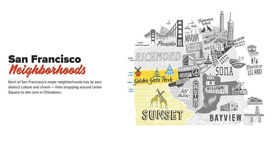
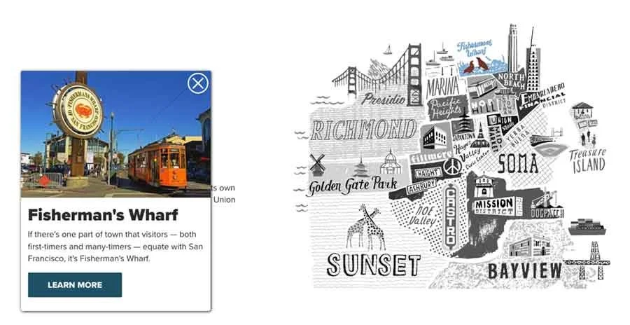
San Francisco Neighbourhoods Map
I created a hand-drawn map illustration for Visit San Francisco’s printed visitor guide, dividing the city into distinct neighbourhoods with flat colour, organic edges, and bold icon illustrations. Each area name was hand-lettered to make the map clear and easy to navigate—giving visitors an immediate sense of place without visual overload.

Illustrated map of San Francisco for a printed neighbourhood guide—designed to integrate with feature copy and help readers navigate key districts.
Over time, the map became a kind of living document - updated and expanded as San Francisco’s visitor priorities evolved. It was reworked for later editions of the guide, adapted for a Travel Trade Meetings Guide, and eventually developed into an interactive online version. Because the illustration was handmade but digitally assembled, it could evolve without losing its structure or character. That adaptability; making a piece flexible enough to grow while keeping its integrity, is a challenge I really enjoy.
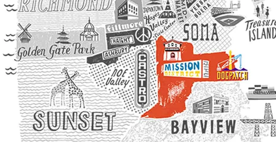
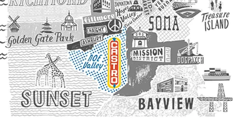
To help bring the interactive version to life, I worked with the web team to deliver organised, isolated layers; breaking the full map into components they could structure to respond to rollovers and clicks, opening up more information about each neighbourhood.
Supporting place identity and navigation
-
Used in print and digital formats
-
Supporting place identity and navigation - Used in print and digital formats -
Frequently asked questions
How much does a tourism map illustration cost?
Costs depend on scope — including the size of the destination, number of attractions or routes, level of detail, and intended use (print, digital, or campaign rollout). Once the brief is defined, I provide a clear quote and timeline.
Projects include structured briefing, layout development, a fully custom illustrated map (no templates), revision stages, and production-ready files for the agreed print and digital uses. Licensing is confirmed upfront.
What’s included in a commissioned destination map?
Can the map highlight key attractions without becoming cluttered?
Yes. Destination maps are designed with clear hierarchy, grouping attractions logically and prioritising what matters most. The aim is to guide exploration without overwhelming the viewer.
Can the map reflect our destination brand or campaign style?
Yes. The map can be aligned with your destination identity or campaign visuals so it integrates naturally with visitor guides, websites, and promotional materials.
Can the map be used across visitor guides, websites, and campaigns?
Yes. Files are prepared for the agreed outputs, whether for print guides, digital platforms, or campaign materials. Alternate crops or format variations can be scoped at the start to avoid later reworking.
How long does a tourism map project take?
Most projects take 2–4 weeks from an agreed brief, depending on scope and stakeholder review stages. If the map is tied to a campaign launch or seasonal promotion, timelines should be discussed early so delivery can be planned accordingly.
Best for:
Tourism boards and travel brands commissioning illustrated destination maps for visitor materials and campaigns
Maps designed to promote places, highlight key areas/attractions, and support trip planning
Projects where the map needs to help visitors explore and engage (print and digital)
Less suitable for:
Personal travel keepsakes (honeymoon maps, family holiday maps).
Template-style map requests
Rush deadlines (under a week)
Commission a destination map
If you’re developing visitor materials or a campaign and need an illustrated destination map, I’d be glad to discuss your project.